This note borrows from the “theory of finance”, to build a maximum Sharpe ratio portfolio of wind and solar farms in Australia’s National Electricity Market (NEM).
The Sharpe ratio in finance is the ratio of the expected return on a security divided by its standard deviation. It’s a measure of the return you get relative to the risk of getting that return.
The idea is that by building a portfolio of securities you can improve your overall Sharpe ratio, that is a portfolio will give you a higher return for a given level of risk than you can get from owning individual securities.
The main conclusions from the analysis that follows is :
(1) Queensland should have a huge role to play in the NEM. It should be getting lots of money for transmission both within the state and for connections South.
(2) Equally, Marinus Link from Tasmania is likely to be just as useful as building offshore wind.
(3) There is a role for offshore wind, although not as big as the Victorians want you to believe.
(4) The existing NEM utility-scale renewable portfolio has too much solar and nowhere near enough wind. The only way that that wouldn’t be true is if storage were far cheaper than it currently appears to be.
If storage was cheaper than it is then the lower cost of solar might make it suitable for charging storage. As it stands, though, my view is that wind plus transmission is cheaper than solar plus storage. I am sure others will have other views.
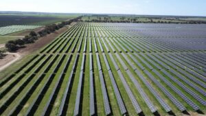
Average output of wind and solar
The average daily output of the portfolio and its variability can be compared with the average daily output of utility VRE (variable renewable energy, but excluding rooftop solar ) in the NEM over the past 12 months.
I set the “optimised” portfolio to have the same total output per day as the existing NEM portfolio of wind and solar farms.

You can see that the “best” portfolio has a much more constant output through the day (and is much less seasonal) and for every half hour has a much lower volatility as compared to the existing, installed wind and solar farms.
Put another way, the mean is more stationary with respect to time of day and season of year, and the variance is lower. The Sharpe ratio (mean/standard deviation) is nearly twice as good as the existing NEM wide portfolio of wind and solar farms.
I might add that although I have yet to prove it, I think it would have a better capacity factor and likely be lower capital cost. Obviously this “best” or optimised portfolio would require much less firming.
The optimised portfolio would be heavily concentrated in Queensland (see fig 3) but the function maximisation algorithm didn’t result in much VRE in Victoria overall by State where O = offshore and numbers are in % and would have about 77% wind and 23% solar.

I realise the following colour scheme is worse than tasteless, but it shows as a percentage of the total portfolio how much would be allocated to each zone that the “optimiser” chooses.
Most of the results are generally what I would have expected, but I was truly astonished to see that the algorithm results in a little bit of Tasmanian solar going into the portfolio.
It’s interesting that the results have more offshore wind off the Illawarra than in Gippsland, probably because of the Tasmanian wind that is included. These results would likely change quite a bit if levelized cost of the energy was included, an extension I plan to do for next time.

The portfolio built by the optimisation algorithm only takes account of the forecast capacity factors for each half hour for each fuel for each REZ.
It doesn’t account for cost, correlation with demand, transmission, social license, rooftop solar. Some of these things (rooftop solar and capital cost) can easily be accommodated and I may do so in a future note. Others are more difficult. Also we aren’t dealing in the real world with a fresh sheet of paper.
However, what I personally take from this analysis is that Queensland should have a huge role to play in the NEM, it should be getting lots of dollars for transmission both within the State and for connections to the south. Equally, Marinus Link is likely to be just as useful as building offshore wind.
These conclusions may change as other factors are thrown into the optimisation algo.
The following map taken from the ISP shows where the REZs are located with the notation first letter = State and then the number is the zone within the State.

Wind and solar farms as a portfolio – the lessons from finance
I wrote about the idea of seeing wind and solar farms through the lens of finance theory ‘s “efficient frontier” last June. In this note, I continue that journey by employing the Sharpe Ratio to build an “optimal” portfolio of wind and solar in the NEM.
The Sharpe ratio in finance is the ratio of the expected return on a security divided by its standard deviation. It’s a measure of the return you get relative to the risk of getting that return.
The idea is that by building a portfolio of securities you can improve your overall Sharpe ratio, that is a portfolio will give you a higher return for a given level of risk than you can get from owning individual securities.
This happens mainly because the standard deviation of a portfolio is less than the standard deviation of the individual securities. They don’t all go up the same amount at the same time and vice versa.
To demonstrate that, you need to calculate the mean expected return of the portfolio and its standard deviation.
I want to avoid the maths as far as possible, mainly because I’m not very good at it, but its important to appreciate that the variability of the portfolio return depends not only on the variability of each stock considered on its own but also their “covariance” or the extent to which stock returns tend to move together.
The other important thing that the portfolio return and standard deviation depend on, is how much you put into each stock. That is the relative weight of the stock in the portfolio. Its finding those weights that is the point of this note.
40 REZs, two fuels, 40 million data points
Translating these ideas into the world of Australian renewable energy our portfolio consists of the 40 REZs that AEMO provided data for in the 2022 ISP.
In each REZ AEMO provided the expected half hourly output between July 2022 and June 2052 of a 1 MW wind farm, and a 1 MW solar farm. In fact for wind they provided a high and low series. So that is basically 120 series of roughly 0.5 million half hourly forecasts each or roughly 60 million data points.
For the wind data I took a simple average of the high and low series for each zone.
In renewable energy we care about (1) the capacity factor = actual output per year/(24/7 output) (2) the variability of the output or how likely it is to be running at any given time, like dinner time and (3) other factors like cost and location.
Solar is more predictable in output than wind but nevertheless has a higher variability because it doesn’t run at night.
The following chart attempsts to illustrate the concept of the Sharpe ratio. It shows the best 15 wind zones sorted in order of Sharpe ratio best to worst.
The chart shows the capacity factors and the volatility. You can see that Queensland in general and North Queensland in particular has both a good capacity factor and a relatively low volatility of output.

The offshore wind zones (in blue) have good capacity factors but are, like the Tasmanian ones typically more volatile than the Queensland ones.
The six best zones as measured by the Sharpe ratio are all in Queensland and Tasmania. No NSW wind farm makes the “best” Sharpe ratio list and only one in South Australia. Again this list doesn’t pay any attention to cost, or demand correlation or access to transmission, or social license.
Repeating the same exercise for solar shows that the capacity factors, and the not shown here Sharpe ratios are much closer together and that Queensland, NSW and South Australia are the best regions for solar.
Also if you compare the scales for the wind and solar charts you will see, as expected, that wind capacity factors are higher than solar and the standard deviation of wind is lower. The latter result is because the wind does blow at night.

For some colour relief and a more pleasing to the eye but generally abstract figure shows the correlation of each of the 80 wind and solar zones with each other. Perhaps as someone suggested it would make a good corporate symbol

The optimisation process
The problem is to find the weights for each zone in the portfolio of wind and solar zones that maximises the sharpe ratio of the portfolio. There are at least two ways of doing this that I know of.
The first way is just to run a loop that throws random weights at the portfolio and then choose the one with the best Sharpe ratio.
There is nothing inherently wrong with this method. The second way and what I did is to use some kind of “solver” engine. I used a solver available as part of the scipi python package . It took 20 minutes and 3000 iterations to find its “best” set of weights which were constrained to be between 0 and 1 and to sum to 1.
The following figure shows the Sharpe ratio for every REZ wind/solar combo as well as for the existing utility wind and solar farms and finally the “Optimised” portfolio.
You can see that the Optimised portfolio performs about twice as well as the exising NEM portfolio and the existing NEM portfolio beats any existing individual REZ. As it turns out the yellow bars are the solar farms and the blue bars the wind farms. Again you can see the uniformity of the solar farms on this scale.