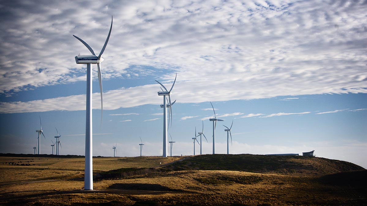
Over my Christmas break, I came across a nostalgic LinkedIn post from former Pacific Hydro CEO, Rob Grant, who reminisced over the 20th anniversary of the commissioning of Challicum Hills Wind Farm in Victoria.

As Rob notes, the wind farm achieved many firsts for utility-scale wind generation in Australia. Similarly, I’ve also seen Fleur Yaxley, who was the project manager, retroactively dub it as ‘the project that launched an industry‘.
Although Challicum Hills was given a 25-year life expectancy, the current CEO of Pacific Blue (formerly known as Pacific Hydro) Domenic Capomolla states that he is optimistic that the generator can extend its lifespan beyond 2030.
This statement, along with further social media comments wondering about the potential LCOE for the project has peaked my interest to loop back to some analysis I published in early November. In that short piece, I pondered the curtailment and site scarcity effects across wind farms by the year they were first connected to the NEM.
Here I’m going to focus in on the long-term technical and commercial performance of the NEM’s first batch of utility-scale wind farms. In this case study I’ve selected the seven units in the table below as 1) there was sufficient data on each project; and 2) they are all likely to be in, or approaching, the final 5 years of their expected design life.

Technical Performance
In my November article titled ‘Bigger or better: Are newer wind farms outperforming older ones?’ I looked at capacity factor for all wind farms, new and old, across the NEM. Capacity Factor as a metric relates most closely to revenue and market value. That article was well received – but a number of readers suggested that (because of increasing curtailment for network and economic reasons) that availability factor would be a more robust measure of technical performance for wind farms as it better encapsulates available wind conditions on site.
For this analysis, however, we can’t use Availability Factor, as these seven wind farms have spent the vast majority of their lifetimes thus far as Non-Scheduled units, which:
- Do not participate in the central dispatch process;
- So do not publish any availability data.
As Paul noted here recently, because of the increasing challenges of declining demand in the NEM, particularly the SA Region, several Non-Scheduled wind farms have begun operating as Semi-Scheduled units more recently. At this point, this has happened in two tranches:
- On 9th December 2021, some Non-Scheduled Wind Farms (e.g. Lake Bonney 1 and Wattle Point) started operating like Semi-Scheduled units.
- On 1st February 2022, three others (e.g. Cathedral Rocks, Mt Millar and Starfish Hill) also changed their mode of operations.
It’s only from the time of those transitions that we have access to Availability for each dispatch interval, so could calculate availability factor – which is not enough history for the purpose of this article.
For this reason, in the chart below I have trended monthly capacity factors for each of these wind farms. For context, I have also plotted the timeline of their schedule status along with the 12-month rolling average of their monthly capacity factor.
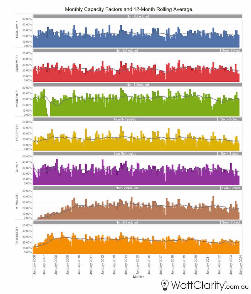
Note: Although these wind farms may have been connected earlier, publicly available market data only exists from January 2006 onwards.
The graphic above is fairly data-rich, so, for ease of viewing, readers can view a higher-resolution version here.
To examine and compare the long-term trends of each of these wind farms against one another I have extracted the 12-month rolling average figures and re-scaled the y-axis into the new chart below.
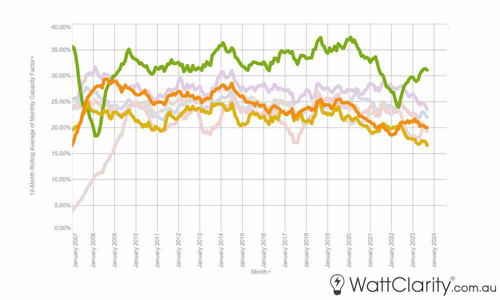
I’ve highlighted Woolnorth (Green), Cathedral Rock (Orange), and Lake Bonney 1 (Yellow) as they show a pronounced slow but declining trend over the past four years. Also, a more recent declining trend for Challicum Hills (Faded Blue), Starfish Hill (Faded Red), Wattle Point (Faded Purple), and Mt Millar (Faded Brown) over the past two years. Declines over the past two years might be somewhat attributed to the change of schedule type (for those based in SA) as mentioned above. Marcelle Gannon, has previously examined the early changes in operations/behaviour of these units since the change.
In addition to this, I will also note that all of these wind farms would have originally signed long-term ‘old style’ PPAs that did not have any contractual obligation to avoid negative prices – which have been accelerating in frequency. Some of these contracts may have expired or been re-negotiated in more recent years – although this would be commercial-in-confidence in any case.
Commercial Performance
As stated, it is expected that these seven wind farms would have been fully or almost-fully hedged under a relatively straightforward pass-through PPA for most of their existence. These wind farms will also have earned revenues for their LGCs as well – as we regularly cover in our GenInsights Quarterly Updates.
As such, ‘black’ spot revenue returns will likely not directly reflect the actual revenues earned by the owners and operators of these generators. However, there is always some counterparty that is exposed to spot prices – so calculating spot revenue on a long-term basis does provide insight into the relative market value of these projects over their lifetime.
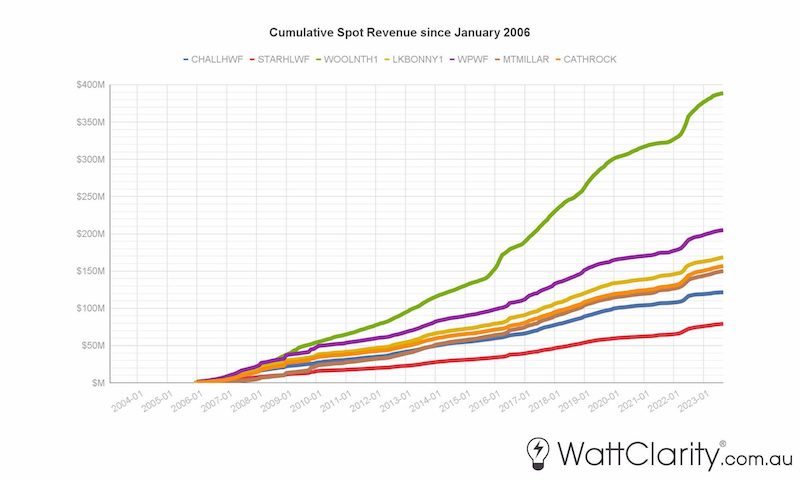
In this first chart, we’ve simply trended the cumulative ‘black’ spot revenue earned by these projects over time and I will note:
- The somewhat different start points for the assets (albeit that these revenues are only calculated starting in January 2006); and
- More importantly, the different sizes of the assets.
To put these cumulative numbers in further context, in Chart 4 below I have normalised these numbers against the reported construction costs and the capacity of each of those units.
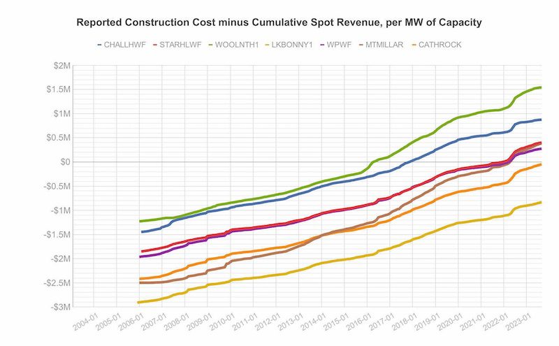
Hopefully, this chart adds some colour to discussions about the market viability of these projects with the benefit of hindsight. But I would warn readers against drawing their own conclusions about a ‘return on investment’ as there is much deeper to dive (e.g. hedging positions, cost of debt, maintenance costs, FCAS costs, amounts received from any grants, LGC revenue, etc. etc.) – and this is almost impossible to estimate reliably from the outside, as much of this information is commercial-in-confidence.
This article was originally published by Watt Clarity. Reproduced here with permission. Read the original version here.


