La Dolce Vita
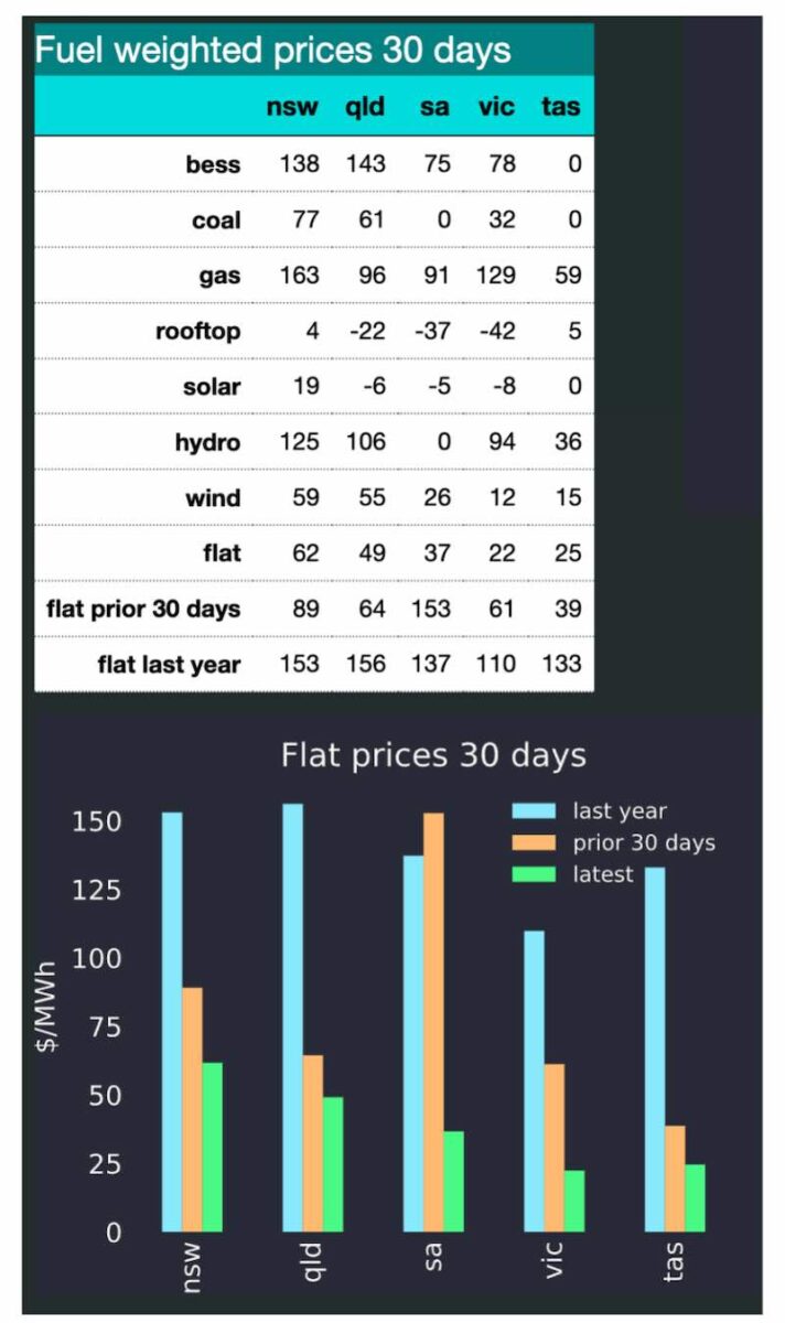
In Spring, demand falls, solar production goes up and electricity prices reflect the overcapacity in the system. In Victoria, flat load prices were just $22/MWh over the past 30 days. Solar weighted prices are mostly negative. Battery storage is mostly just undercutting gas.
The fact that flat prices in every state – other than New South Wales – are under $50/MWh shows, in my opinion, that if we build enough renewable capacity the low variable costs will lead to low average prices. The challenge is to get the capacity built.
In Winter, when demand is higher and solar production is lower, we are going to need lots more wind and the associated transmission. It’s that simple.
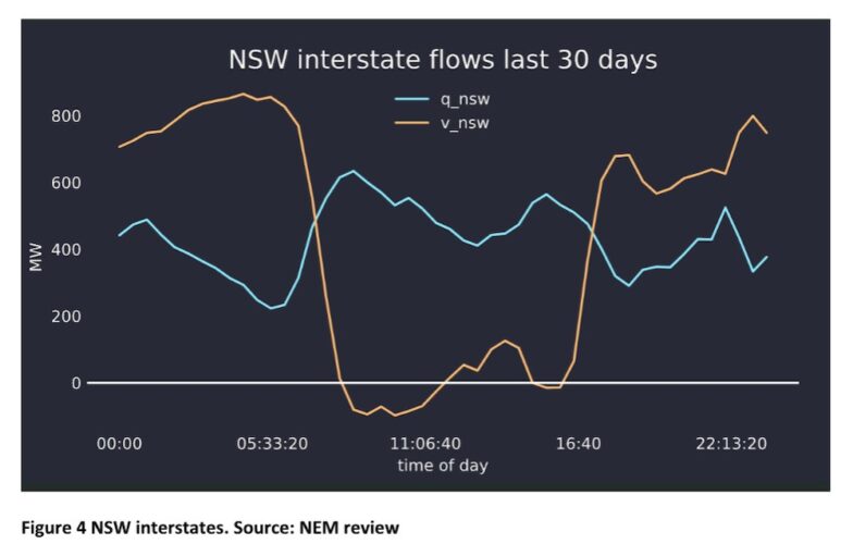
The daily pattern of prices can be seen as follows – I’ve just randomly selected a couple of states. Keen observers will see batteries actually showing up on the supply graphs, but also that Victoria is a net importer in the the middle of the day despite negative prices. That’s down to a lack of transmission capacity to NSW.


The NSW interstate time of day shows exports to Victoria in the middle of the day, at the same time that South Australia wants to export to Victoria. I guess it will be useful in 2027 when Yallourn closes. Right now its killing Victorian generators.
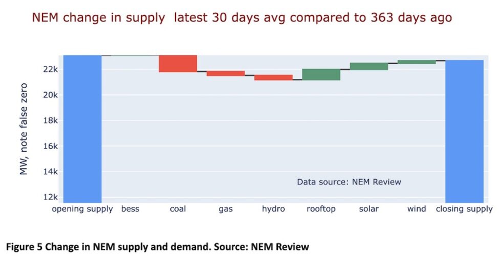
Looking at the NEM, we can see the change in supply vs a year ago using the waterfall graph beloved of CFO’s when explaining results to the analyst community.
Renewable production compared to a year ago and the decarbonisation progress are shown below. The jaws are closing but not fast enough. I don’t show it, but growth in wind production is slowing right down.

Next in this brief note, which nevertheless took many, many hours of work to get the underlying website for the charts in fit shape, we can look at futures.
I show a different take on futures. Specifically, I look at a rolling two-year ahead and three-year ahead futures prices. That is, in 2020 what did the market expect for 2022 and 2023 and compare that with the spot price.

I take two basic messages from this chart. Firstly, that three year ahead futures are less volatile than two year ahead. Right now the market is expecting things in three years time to be the same as the spot price.
Secondly, and unsurprisingly, the futures price tracks, albeit in a softer fashion, the spot price. Generally, futures lag spot prices by a bit with two year futures tracking spot more closely than three year.