Australia is regularly credited with having one of the best solar resources in the world and, in turn, has led the world in the installation of solar panels on the rooftops of households and businesses.
But as governments target higher and higher shares of renewable energy generation – with much of the heavy lifting on this to be done by small and large-scale solar – making the most of the nation’s PV assets will be key.
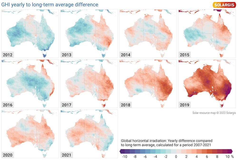
To this end, solar data provider and consultant Solargis has released a 10-year analysis of irradiance that highlights the inherent geographical variability of the resource, as well as the impacts of extreme weather and long-term irradiance shortfalls in key global solar markets – including Australia.
Solargis says this analysis and the accompanying Solar Performance Maps illustrate how solar irradiance levels have deviated from the long-term averages often used to underpin production estimates and financial models, highlighting the variability challenge presented by solar.
Solargis says the maps of Australia illustrate that it has experienced significant irradiance variability over the last five years, compared to long-term averages. Many solar project owners have reported lower output in the last year or so because of those changes.
Solargis also says this is reflective of extreme weather conditions that contributed to major events like the “Black Summer” bushfire season of 2019-2020.
“We are seeing margins tighten on global solar projects, due to multiple factors like the phase out of tax credits and subsidies, price volatility and rising supply chain costs,” said Solargis CEO Marcel Suri in comments this week.
“High-quality solar data will help to better understand and address deviations from expected production, forecast short-term performance and ultimately support effective integration into modern digitalised grids.