What is the case for building a bridge, or its electrical equivalent, an interconnector? Three possible answers arise. First, it allows you to get a resource that you otherwise could not get; second it allows you to import cheaper production to replace your own more expensive production; or third it allows you to diversify the risk of supply constraints.
The first of these is not a benefit in any part of the National Electricity Market – we can make electricity easily in all NEM States and so don’t need interconnectors to ensure supply.
The second of these has been a rationale for interconnection in the past: coal and gas resources differ across our states and so there has been some benefit from trade. Victoria has long been an electricity exporter for this reason.
But this is not a rationale for interconnection in our decarbonised future. CSIRO says, and we all seem to agree, that the cost of wind generation, solar generation and battery storage does not vary meaningfully across the NEM. Indeed the combination of small interstate differences on technology cost and resource productivity of wind and solar means there is inconsequential value in relation to the enormous cost of interconnection.
So this leaves the third possibility: diversification of supply variability by connecting areas where the wind blows or sun shines in some places but not others, at the same time. Is there value in this that justifies interconnection?
AEMO, and network asset owners, insist that there is, but they have failed to provide a body of evidence or analysis to support its claim.
In this note I test AEMO’s claim using the evidence of what we can see in the NEM, now, from the production of electricity powered by the wind and sun in New South Wales, Victoria and South Australia.
There are 16 wind farms in NSW, 38 in Victoria and 23 in South Australia with their own despatch unit IDs and they produce data every five minutes on their production. In the quarter just finished they provided 7%, 26% and 42% respectively of end-use electrical consumption in these states.
In addition, each of these States has good rooftop solar data. In the quarter just finished, from AEMO’s data estimates of rooftop solar production we find that that rooftop solar supplied 9%, 8% and 16% respectively of end-user demand in NSW, Victoria and SA. Finally, there are 36 solar farms in NSW, 10 in Victoria and 16 in SA that produced 8%, 3% and 5% respectively of the electricity consumed in each state in the last quarter.
I have left Queensland and Tasmania out of the analysis. Queensland is left out because it is weakly connected with NSW and has very little wind generation (just 4% of end user demand year-to-date) and because variability in Queensland to Victoria or SA is a much more problematic thing to consider since it is one step (i.e. NSW) removed, so diversity between Queensland and NSW is likely to be soaked up in NSW and little or no residual left for SA or Victoria.
Tasmania is left out because I am interested here in focusing specifically on the mainland interconnectors. The coming (hopefully avoided!) train smash that is Marinus merits its own article(s) and I will get to those later.
I obtained the five-minute production data (from AEMO) on the electricity from these sources by type (wind, large scale solar and rooftop solar) for each state, for the year to 7 October 2023 (nothing particular about this, it’s just the day that I did these sums). Then I compared the average production, by type, for each hour of a 24 hour day, across the year.
Specifically, I worked out the average in each hour (so, the average of the production for the 12 five minutes in each hour, e.g. 1am to 2am, that recurs on the 365 days in the year. This means the average of 4,380 data points in each hour for each type.
In the charts that follow I show these average values, normalised by the highest average in all the 24 hours.
I also inspected the upper and lower reaches of the data (so the 1st,5th, 95th and 99th percentiles) to see if the conclusions we can draw from observing the average values are still relevant at those points in the distribution.
Let’s start with rooftop solar. What do you expect? Well Australia is a sunny country, a sunny day is the default. Is this what the data shows?
Indeed it is, the chart below shows a very tight correlation of rooftop solar production in NSW, Victoria and SA. The Pearson Product Moment is 89% between Victoria and NSW and 92.2% between SA and Victoria. The small variation in the chart below is likely to be explained by longitude, mainly.
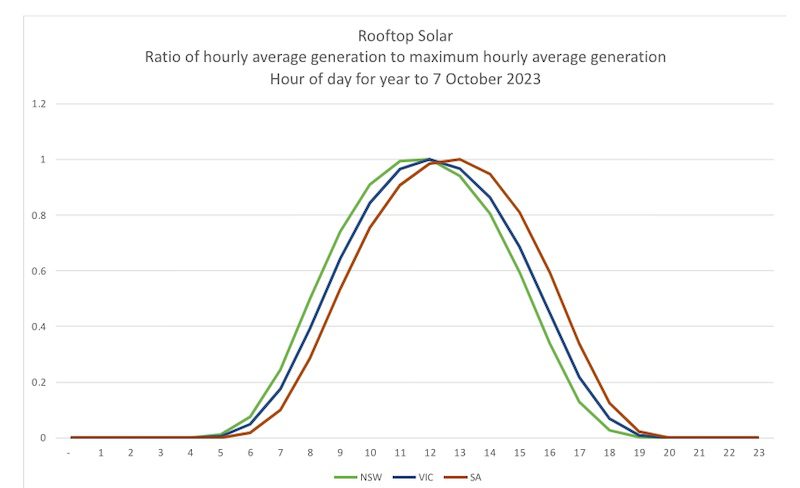
So, clearly, you can’t justify building an interconnector to export rooftop solar from one state to another on the basis of the diversity of rooftop solar production. It is perplexing that AEMO has justified VNI-West on the basis of the benefit of exporting rooftop solar from Victoria to NSW.
Let’s turn next to large-scale solar. What do you expect? Surely much the same as rooftop solar: high correlation? Indeed this is what we see in the chart below.
PPMs are 86.9% between Victoria and NSW and 85.4% between Victoria and SA. The flatter production profile relative to rooftop solar is explained by axis tracking and usually substantial over-sizing of production capacity relative to inverter size in most solar farms.
So, clearly, you can’t justify building an interconnector to export farmed solar from one state to another on the basis of the diversity of farmed solar production.

Next, let’s turn to wind. What do you expect? I expect high correlation. PPMs are still high in statistical terms 45.7% NSW-Victoria and 52.3% SA-Victoria, but lower than solar, as expected where correlation is extremely high. But how does wind correlation vary by time of day?

Across the day, as the chart shows, wind in NSW and Victoria on average is very correlated from 7pm to 7am. Even during much of the day, from 7am to 3pm, there is little difference on average. It is only from 3pm to 7pm that there is a little bit of a gap.
Let’s estimate the value of this. The chart shows that, on average, in this window, Victorian windfarms can be expect to produce at about 90% of their maximum hourly average production. In NSW, that number falls to about 80%. So, about 10 percentage points difference.
Now, the maximum hourly average production in both NSW and Victoria is around 40% of installed capacity. So, per MW of wind capacity installed in Victoria rather than in NSW, NSW can expect that, on average, it would get 10%*40% = 4% more production on average from a wind farm in Victoria from 3pm to 7pm than from a wind farm in NSW.
But wait, it gets worse. What value does that 4% increase in average productivity of wind really offer? In capacity markets in Europe and Britain, the firmness factor that is applied to determine the firm (reliable) value of wind is around 15%.
This gives an estimate of the production that can be relied upon with some reasonable level of certainty. So, to a rational transmission planner (or a minister considering the advice of a transmission planner) they need to weigh the certain cost of an interconnector against the certain benefit of interconnection.
If that transmission planner (or minister) was to ask “what firm supply do we get from incurring this cost” the answer would be 15% of 4% = 0.6%.
So, from NSW’s perspective, putting in an interconnector to import wind generation from Victoria results in a firm supply benefit worth 0.6% of each MW of wind supply built in Victoria rather than NSW.
If you were the minister in Sydney or Melbourne, how could you possibly justify imposing the costs of an interconnector if you knew this?
I mentioned that I also looked at the top and the bottom of the distributions; what did I see? At the bottom, when hourly wind production is low, we get a very tight correlation of wind in NSW and Victoria. All that is left on very still days is a bit of morning and evening land-sea temperature differential driven breezes.
What about very windy days? Again, very high correlation – when it is windy it blows throughout the day in NSW and Victoria.
The critical thinker might suggest that the issue is not resource diversity looking separately at wind and solar but rather looking at the coincident portfolio of wind and solar in each state.
What, then, do we see when we look at the portfolio? You guessed: very high correlation. Specifically, Person Product Moment scores of 67.7% for NSW-Victoria and 68.1% for SA-Victoria.
Of course, none of this is to say that when you look at individual wind farms, you do not see diversity in production relative to other wind farms in the same state or in neighbouring states.
But this does not of itself justify interconnection.
Indeed, as we have previously pointed out, even the unidentified wind “resource” data that AEMO has used to support interconnection finds greater potential for intra-state diversification than inter-state diversification.
At the AFR’s Energy and Climate Summit this week, AEMO made the case for interconnection, firstly by alluding to our fossil fuel past (when interconnection had some value) and then, by anecdote, alluding to renewable resource diversification in our renewable future: “just this past week we’ve seen that it can be cold and windy in Victoria, but sunny and warm in NSW.”
But the plural of anecdote is not data. The data is plentiful and easily accessible, indeed it’s data that AEMO publishes that I have used here.
Analysis of them seems to lead to a clear conclusion that invalidates the (ambiguous) anecdote. (As an aside the anecdote seems to crumble under its own weight: over the last week the wind and sun in “cold and windy” Victoria met 36% of Victoria’s end use demand, and in “sunny and warm” NSW it was 30% of end user demand, pretty much bang-on the quarterly averages.)
In his AFR speech, AEMO’s CEO suggested, reasonably, that social licence depends on “quality decisions”. In this pursuit of quality decisions, perhaps AEMO might critically (and publicly) assess the evidence presented in this note.
If it fails to find substantive flaw, AEMO might then explain how it will be responding to this evidence in revising its assessment of transmission expansions.
Indeed, the inevitable conclusion of this analysis is not just that interconnectors like VNI-West are unlikely to have a net benefit, but that they are unlikely to have any consequential benefit at all in a future NEM that relies on the wind and sun.
Professor Bruce Mountain is Director of the Victoria Energy Policy Centre at Victoria University